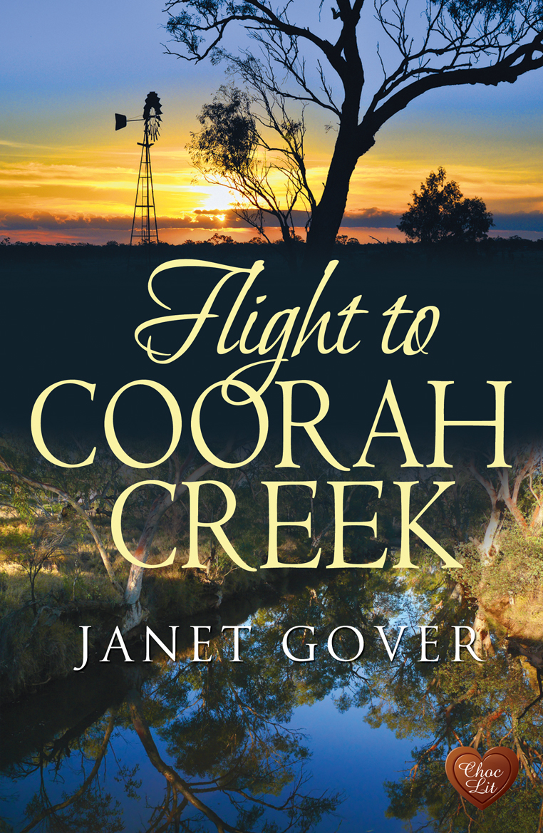
I have about as much artistic design ability as my cat – possibly less. So my book covers make me nervous.
I know my book better than anyone… and I should know what cover will suit it. But I don’t. I have ideas – and they are usually rubbish – because I am a writer, not a designer.
The lovely people at Choc Lit believe the writers should be involved in the cover design – which is both great and terrifying. It’s great because the book is my baby and I want to be involved in every part of bringing it to my readers. It’s terrifying because I can almost draw a stick man on a good day.
Years ago – when competing with one of my horses, a piece of my gear came loose in the competition ring. I was mortified because it was my mistake. After handing out the ribbons (to other people) the judge came to me and told me my horse had performed brilliantly and should have won – but I let her down. I felt so bad about that, I cried.
I did not want to let my book down.
Choc Lit’s cover designer – the wonderful Berni Stevens – sent me a number of different ideas.. and asked what I thought. We went back and forth a few times… until two days ago, this dropped into my inbox:

I knew in an instant that we had it.
I could say it’s because the images brilliantly portray the outback setting. Or that the metaphors of looking outwards to the sky and down to the reflection in the water match the themes of the book. I could say … a lot of things.
But if you want the truth – I love it because it is just so pretty!
It looks so good alongside all the other fab Choc Lit covers that are coming out next year.
I just can’t wait to see how great it looks in a book shop when it’s released in March 2014.
Thanks Berni – and all the team at Choc Lit.


Comments
38 responses to “Cover-phobia – or fear of your book cover”
I LOVE it, Janet. It’s striking and different. Fabulous!!
I love it too, Liz. Really, really happy.
Wowwww! Wasn’t that worth waiting for? It’s tremendous, Janet – I hope that any tears were tears of joy!
I confess – there were some misty moments when I saw the final artwork. So happy to have my book in the hands of the fab team at Choc Lit.
Brilliant Janet, very striking and looks like it will fit your story perfectly!
Glad you like it Christina. It is a perfect fit for the story – in fact, some scenes may well have been set in where those photos were taken.
Fab cover, another Berni winner!
It is indeed. Berni shares my love of wild open spaces – so she totally got what I was about.
Great cover Janet, and really pleased you’re happy with it too.
I have just turned it into the wallpaper for my work laptop – so when working (as I am today) I keep catching glimpses of the cover – makes the working day much more fun.
Fabulous cover, Janet! It so captures my imagination of the Australian outback, a place I’ve never been but would love to go one day. And you’re right, it looks just perfect next to some of the other 2014 covers. Berni did an excellent job!
Hx
I don’t mean to wish my life away – but I am really eager for 2014 – there are some books there I really want to read. J x
I love it, Janet! Very evocative. Congrats!
Thanks. It looks so good among the Choc Lit covers – such a range of covers – and books too. I am proud to be among them.
Thank you so much Janet – I’m thrilled you’re thrilled. hen researching for pics of the Australian Outback, I was amazed at the similarity between it and the Utah desert, which as you know, as is a place close to my heart. The same red rock, red dirt and blue, blue skies.
I’m also amazed at how many things we like the same – horses, rock music and deserts, to name just three . . . 🙂
Berni, I thought the same thing when I was in the US south-west. I felt quite at home there. I knew you would ‘get’ Coorah Creek. Thanks so much for the hard work you out into this.
It’s terrific – worth waiting for! Part of the reason it’s so effective, I think, is that blue and orange are at the oppposite ends of the spectrum which gives it that extra something which lifts the heart. And I agree with Henri, it works really well with the other covers. Ex
I hadn’t thought about the colours in quite that way, Elizabeth – but you are right. I think it does lift the heart. It certainly lifted mine when I saw it.
How lovely for you to have been given an element of choice, I’m not sure that’s always the case. So, to have exactly the cover you want must be the icing on the cake! Congratulations, looking forward to reading it.
Cara, that’s one of the great things about Choc Lit as a publisher – it’s very much a collaboration with other people who love books as much as I do. Today is a happy author bunny day!
Lovely cover!! Choc Lit do seem very good at coming up with just the right design!
Thanks Carol – I think the Choc Lit covers are just great. They avoid the stereotypes, but still give the flavour. That’s a real skill.
Wow. That’s a gorgeous cover. As are all the rest of them. Brilliant!
Brilliant is a good word for it – your turn soon. 🙂
Ah, Janet, what a beaut! Makes me homesick.
Choc Lit are consistently strong with their covers – haven’t seen one yet that I haven’t loved!
It makes me homesick too Kat – I’ve lived in London for a few years now – but something always draws me back Down Under. Maybe that’s why I write about Australia so much – because I miss it.
Your new cover is gorgeous, Janet. Your previous LBD covers didn’t really do your work justice IMO. I look forward to reading Flight to Corah Creek.
Thank you Heather. I did like my LBD covers – but they were very chic lit. This book has a wonderfully dark and damaged hero – not a chic lit hero at all. I do hope you like it.. come March.
I love your cover design, Janet, weel done! It’s thought provoking, mysterious…and the sky is beautiful. It looks like dawn is just breaking; very exciting!
I think it is exciting too, Theresa – and there is a bit of a mysterious feel to it – like nothing is as simple as it seems. I think is it a good match for the book.
I’m beginning to think Berni isn’t human. 🙂 Or at least, is super-human. How does she do it, ever single time?
Berni IS the cover goddess – there is no dispute. Our books are in very safe hands.
Love it, Janet, and I agree with Heather about the LBD books. ChocLIt are giving attention to the individual books, not trying for uniformity – and what a range next year! ChocLit and Accent are proving there is room for the small publisher to be successful in today’s market.
I think you are right Lesley.. in fact, as the market continues to change, I think the smaller publishers are gong to be the ones to watch. They are closer to their authors and, I think, closer to the readers too. More in tune with what the readers want – and more willing to give something new a try. They are also able to respond to the market and to technology changes more easily. Those of us with publishers like Choc Lit and Accent are fortunate. Of course – you and I also know we also deserve the best 🙂
That cover is amazing! I can’t wait to read the book. I think its great that you get input in deciding the cover of your book. The other covers are amazing as well!
Thanks Chanpreet – I think it is amazing. I can’t take any credit for it though – the ideas were all the designer’s. The Choc Lit designer reads the books before she does the covers – which a lot of designers don’t. I think that is why she does such fabulous work. I was able to guide her a bit with specifics of what I thought worked and didn’t work – but all the good stuff is all hers (as you can see from all her other fab covers). It’s a great team to work with – Oh yes- I like reading the books too (VBG).
Perfect I’d say…you can feel it, that’s what works for me! x
I’m now starting to worry – will the book live up to the cover? Eeek!